Thursday, 25 November 2010

NME Double Page Spread


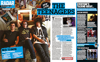
This double page spread was taken from NME magazine. The colour scheme is bright blue and black which already gives the audience the impression that the pages are from a rock magazine as they are bold and quite masculine. The rock genre is generally more preferred from males rather than females so this would be a suitable colour scheme. The bright blue colour really makes the bold black titles stand out effectively. It will also attract the target audience as it is very eye catching. The main article image takes up the whole left left page of the spread which if effective as it looks appealing and is easy on the eye. Readers will be attracted to this spread as it isn't full of just text. The main image is of the band 'The teenagers' lying on a bed. With the band being called 'The Teenagers', this is a good image to use as it shows a typical representation and is stereotypical of teenagers. Need to know facts about the band are included on the bottom left side of the double page spread, which will appeal to the target audience as it is of interest to them. Also, it is an effective way of getting the readers   attention as they are short, quick facts which are easy to read. The main article has two coloums and is on the right side of the spread.

NME Contents


This contents page was taken from an issue of ‘NME’ magazine. The colour scheme is predominantly red, black and white which is an appealing scheme to use as the colours compliment each other well and stand out together. The title of the magazine ‘NME’ is in a quite large font at the top of the page. This makes it obvious and suggests that it is an important factor. It also stands out as the font colour used is red with a white outline against a block of black colour. This gives the name of the magazine emphasis. The title of the page is along the route of the eye so people will spot it easily. There is a strip down the left hand side of the page displaying all the bands that are featured inside the magazine along with the page number they are on. This will attract the audience as they want to know what sort of music to expect in the magazine. The artists’ names are in a red font against a white background which makes it stand out too. There is an image in the centre of the contents page of one of the featured bands which will also suggest the type of genre and music to expect inside the magazine. This image takes up a vast amount of the contents page which suggests it will be one of the most important articles and will be the most popular feature of the magazine. The picture reflects the genre and style of the magazine and suggests to the audience what sort of artists to expect inside. The layout of the page is well presented and organised. The way that the page is quite neatly arranged allows the reader to easily navigate around the page. The sub headings also stand out as they are in a larger font which makes them appear more obvious to the reader. This is good as the audience will know what sort of articles to expect inside. Most of the sub headings are white in a block colour of black which looks eye-catching and will grab the audiences’ attention as the colours are contrasting and therefore work well together. The text used on the cover is quite informal and to the point which is effective as it will be easy for the audience to read meaning they will be more inclined to buy the magazine. The text used on the cover is quite informal and to the point which is effective as it will be easy for the audience to read meaning they will be more inclined to buy the magazine. Articles inside the magazine include things such as reviews, interviews, gigs, news and new music which are all things that would appeal to the target audience as they are expectations of a music magazine. It is very clear to the reader what information and what to expect on each page. There is also an offer at the bottom of the page, along the route of the eye, for a subscription to the magazine which would appeal to the audience as it is very bold and stands out. Therefore the readers are more likely to spot it and consider subscribing.

NME Cover


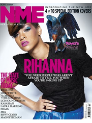
NME is a popular music magazine and therefore features a range of different types of new music. The target audience for this magazine is quite widespread so needs to be suitable for most people, especially the younger audience. It is aimed at people who are interested in new, in style music and who like to keep up to date with music. The font colour scheme used on this cover is black and white which is quite simple but stands out and work well together. Also, the type of font used is the same throughout the cover, giving it an individual style and theme. The font style used is quite simple yet effective as it is easily readable which will make the reader more inclined to buy the magazine. The title is in the masthead which is in a much larger, bold font in white. This stands out against the dark main image. Also the title is also in the foreground which makes it clear and easy to read, making it obvious to the audience and easy to spot. In the route of the eye, there are some cover lines with the main one being at the bottom of the page. The text is in a bold, large font so it stands out. This is because it is the main cover line so it needs to attract the audience and be an appealing story. This particular cover line is about the cover artist who is currently in the charts and therefore will attract people who are interested in the popular genre. The other cover lines are in a smaller font as they are less important but still stand out against the background colour. Some of the cover lines are in the hotspot zones which means the audience will spot them easily. One cover line is a list of new artists which will be featured in the magazine attracting the target audience as they know who will be reading about inside. This particular cover has few cover lines and is more about the image. Having fewer text on the cover could make the audience less attracted to the magazine as they won’t know what to expect inside. The image is the focus of the magazine so needs to be appealing and attract the target audience. Therefore it needs to be a current music artist as it will appeal to the specific audience. The cover lines appeal to the specified target audience as they include things such as ‘the state of music today’ so it will include current music. The cover is also the second of ‘10 special edition covers’ which would attract the audience more as it is different from the usual. Also this particular cover line is along the route of the eye so people will spot it easily meaning that they will be more likely to buy the magazine. The overall look of the cover is quite simple yet very effective as the colour and font schemes work well together.

Q Double Page Spread

       
This particular double page spread has been taken from Q magazine. One  wholeside of the double page spread is a medium close up of Rihanna to show that she is the artist being interviewed. The main colour in the photograph is black and the clothes she is wearing are black which makes her face, hair and megaphone stand out. The artists hair is bright red so the black background works well as the colours compliment each other. Rihannas photograph is very glamourous and would appeal to both males and females. The black colour scheme in the photo makes the photograph a sense of mystery and her expression on her face makes her seem fierce. This connotes what her music is like, and what the article is focused on. Also, what the reader will expect from her music. The article colour scheme is very plain, and bold which makes the article more clean cut and easier to read. The text stand out so it is easy for the reader and makes them more likely to read the article.The questions are in a bold font, which is useful  if you are looking for her response on a particular subject then you could find it quick without reading the whole article. The heading for the title, is in capital letters, and is short and simple. It tells you what this article is going to be about ‘RIHANNA’. 

Q Contents


This is the contents page from an issue of ‘Q’ magazine. The name of the magazine ‘Q’ has been placed on the top left corner of the contents page along with the title of the page ‘Contents’. This stands out as it is in a white font against a black bordering block. As black and white are contrasting colours the look works well. Both the name of the magazine and title of the page are along the route of the eye so people will spot it easily. The date is also placed and website of the magazine is at the top of the page too. The website is across the route of the eye so people will spot it easily, meaning they are more likely to visit the site. They are both in a smaller font though as they are less important. Although, the name is quite small on the page, it still stands out as it is larger than the rest of the text and a white font in a block of red colour. These colours compliment each other well too. This suggests that the name of the magazine is an important feature as it stands out. The layout of the page is well presented and organised. The way that the page is neatly ordered allows the reader to easily navigate around the page. The article information is located on the left hand side of the page whereas the images are positioned on the right hand side. The sub headings also stand out as they are in a white font with a red blocked border around them. They are bigger than the other text on the page, except for the title, as they need to attract the audience to the articles. The main image on the contents page is of the band ‘The Courteeners’. This image takes up most of the contents page which suggest it is the most important and will be the most popular feature of the magazine. The picture reflects the genre and style of the magazine and suggests to the audience what sort of artists to expect inside. The colour scheme used on the contents is black, white and red and it the same for all ‘Q’ magazines. However, this particular contents page has gold text as it is a ‘Oasis’ special edition which emphasizes the band. The text used on the cover is quite informal and to the point which is effective as it will be easy for the audience to read meaning they will be more inclined to buy the magazine. For example words like ‘dodgy’ are used which is quite casual language. This would appeal to the audience as they know the magazine will be an easy read. It is very clear to the reader what information and what to expect on each page. Readers’ reviews are shown at the bottom of the page. The magazine is referred to as ‘the world’s biggest and best music magazine’ which would encourage the audience to buy the magazine. 

Q Cover

 Q is a popular music magazine and therefore features a range of different types of new music. The target audience for this magazine is quite widespread as it has a great variety of different new music, so it needs to be suitable for most people, especially the younger audience. It is aimed at people who are interested in new, recent popular music and who like to keep up to date with what’s in the charts. The main feature of this particular cover is an image of an artist who is currently in the charts. This will appeal to the target audience because this magazine is aimed at the popular genre. All of the text is placed over the top of the picture making the writing clear and easy to read as people want to know what’s inside the magazine. The title of the magazine is in the masthead and is in front of the image which makes it stand out more. It also makes it appear bolder. The title is also in a much larger font compared to the cover lines which makes it stand out the most and makes it appear obvious to the audience and tells the reader straight away what sort of magazine they are reading. The name of the main artist featured stands out from the background due to its large font size and colour. The fonts used throughout the front cover are very similar making it clear and simple to read. The clear circle on the right hand side of the page stands out as it is in a circle. It advertises another artist featured in the magazine and tells readers about it before they open the magazine. There is a particular theme used on this magazine cover. For example the colour scheme used is black, grey, red and white. This is an eye-catching scheme to use as the colours compliment each other and will catch the audience’s attention. It will appeal to both females and males too. Some of the cover lines are highlighted in a white colour which makes them appear more noticeable so people will tend to look at them. Therefore these cover lines needs to be interesting and attract the specific target audience. Also, some of the cover lines are in the hotspot zones which means the audience will spot them easily. Along the route of the eye there are many cover lines including the main feature one.  The main cover line stands out amongst the rest as it is in a much larger, bolder and bright coloured font. This will easily grab the attention of the reader so needs to stand out. The other cover lines on this magazine are smaller and are teasers of what is inside the magazine, including things like interviews with artists and new music. These are all things which will immediately attract the target audience.


Initial Research Of Different Genres


This music magazine, Vibe, is mainly aimed at younger people who like and are interested in popular music. I know this because it predominantly features R&B and hip hop music artists, such as Kanye West, which are usually associated with the interests of younger people. The colour scheme used on this cover stands out as they are contrasting colours. There is only one font used on the cover which makes it more professional and gives the magazine a theme making it look unique. Different font sizes are used for the cover lines to make them stand out and to display the importance of each one. The mast head is in the largest font however, as it needs to be prominent. It is in the background behind the image though, and is hard to read. The main feature of this front cover is the image in the centre which would attract the specified target audience. The image is a simple head shot with no props.

Kerrang is a rock music magazine so is aimed at people who like this genre. The title is in a black font against a white banner which makes it stand out and emphasizes the name of the magazine. Also, the type of font used is suitable for this genre as it looks quite masculine and fierce. This is good as males tend to prefer this sort of music rather than females. The magazine layout is quite cluttered and busy suggesting an energetic feel to the magazine. This would therefore appeal to people who are interested in the rock genre. There are several smaller images of artists featured inside the issue used on this front cover as well as the main image which will appeal to the specified audience. The main image of the band also looks quite aggressive. There are teasers on the cover telling the reader of things inside such as a poster.

NME is a popular music magazine and therefore features a range of different types of new music. The target audience for this magazine is quite widespread so needs to be suitable for most people, especially the younger audience. It is aimed at people who are interested in new, in style music and who like to keep up to date with what’s currently in the charts. The cover is also the fourth of ‘10 special edition covers’ which would attract the audience further as it is different from the usual. This specific cover is quite simple yet effective as the colours used compliment each other well and the design is quite ordered. The title of the magazine is over the top of the image which will make it appear obvious to the reader. The cover is to the point and easily readable so will attract the audience as it isn’t to busy. The plain background works well too.

I have analysed three different genres of music magazines which were R&B/hip hop, rock and popular music. From making this analysis I have decided I am going to base my magazine on popular music. This type of magazine features new and recent music which are in the charts. The layout of this genre of music magazine is quite simple yet appealing.  I think this type of magazine would be easiest to design and make. Also, the pop genre of music is of interest to me. 

Monday, 25 October 2010

Final Magazine Cover

Photo Shoot Plan

Models
Neale Wade Student
Locations
Picture to be taken preferably in Neale Wade school against blank canvas
Equipment
Camera
Costumes
Neale Wade school uniform – school jumper with logo, polo and black trousers
Props
Books and folders
Shot types
Close up shot from the waist up of a student
Dates and Times
I plan to do the photo shoot during the week beginning 4 October so I have time to complete the magazine
I will complete the shoot during the school day

Draft Cover And Contents Analysis


I used a blue colour scheme for my first design and I think the overall look is quite good as it would be suitable for both females and males. Also, it’s quite formal so would suit a school magazine. The masthead does stand out as it is bold and is in a large font. But it could be seen as dull because the colour is black. For the front page of the magazine I put most of the cover lines to the left hand side of the page which makes it an ordered design. However, this doesn’t fit the principal of the route of the eye as the majority of the text is focused on the one side. Although, the main cover line is across the page so is easy to spot. Also the main cover line is in a larger font making it stand out more. The image I would use for this design would be on the right side. I used the same font throughout the cover of the magazine but used different font sizes to make it more appealing and to make it more noticeable. The font is a serif font so is quite formal for a school magazine.  The contents page of the magazine is quite simple but follows the theme of the cover. This is good as it gives the magazine schemes of fonts and colour making it recognisable. I have put four images down the left side of the contents so it makes it more appealing to the audience. The headlines in the contents are made to attract students. For example there is a chance to win an iPod which would appeal to this specified age. 


For this second design of a school magazine I used a black, red and white colour scheme. This scheme is good as it stands out, and would be suitable for a ‘Neale Wade’ magazine as they are the school colours. The masthead stands out as the white font works well against red. The image would be in the centre of the cover making it the main attraction. Therefore, there are less cover lines and text. The cover line going down the right hand side of the page is effective and would grab the audience’s attention so the font is larger. I have used the same font for the cover and the contents giving the magazine an individual theme. This works well as it makes the magazine more professional. For the cover lines on the front cover I have used black for the font. This looks quite dull, and to improve this factor I could used either red or white instead as they are part of the colour scheme. It would also make it more attractive if a variety of colours are used. The cover lines are along the route of the eye too, which is good as they are easy to spot. For the contents I used the same colour scheme and same font. The headlines are all in different font sizes and colours making it more attractive and energetic, so it would appeal more to the students. The title is in a larger sized font making it stand out more. The contents page also contains three images scattered around the page making it more attractive. The red strip along the left side of the page too makes it more appealing along with the patterned borders around the text. The headlines would appeal to the students as well as they have things such as activity pages.


I used a blue, green and yellow colour scheme for this final design. The scheme is used throughout the contents and the cover so it looks more professional. The masthead stands out as the size of the font is large and bold. For the cover lines I used the same font, so the theme is continuous. However, the sizes and colours are all different so it makes it more appealing. The yellow used for some of the text doesn’t stand out very well; this could be improved by using a different colour in the scheme.  The border on the magazine cover makes it more attractive and would appeal more to the audience. An image is the main feature of the magazine right in the centre of the cover. This would also appeal to the audience. The cover lines follow the route of the eye rule though, so they would be easy to spot, attracting people’s attention. I think the overall design of the front cover is quite boring and could be improved. The theme of the colours and font is continued on the contents page too. The contents page looks more attractive and professional than the cover as it is more ordered and has a specific style. The page looks quite formal too. The four images on the contents page will make it more appealing to the students too. I used different colours for each headline making it stand out more. The headlines on the contents page would appeal to students as they include things like events of the month, keeping them up to date!