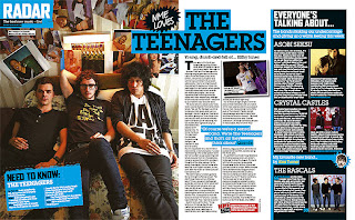
This double page spread was taken from NME magazine. The colour scheme is bright blue and black which already gives the audience the impression that the pages are from a rock magazine as they are bold and quite masculine. The rock genre is generally more preferred from males rather than females so this would be a suitable colour scheme. The bright blue colour really makes the bold black titles stand out effectively. It will also attract the target audience as it is very eye catching. The main article image takes up the whole left left page of the spread which if effective as it looks appealing and is easy on the eye. Readers will be attracted to this spread as it isn't full of just text. The main image is of the band 'The teenagers' lying on a bed. With the band being called 'The Teenagers', this is a good image to use as it shows a typical representation and is stereotypical of teenagers. Need to know facts about the band are included on the bottom left side of the double page spread, which will appeal to the target audience as it is of interest to them. Also, it is an effective way of getting the readers attention as they are short, quick facts which are easy to read. The main article has two coloums and is on the right side of the spread.
No comments:
Post a Comment