This music magazine, Vibe, is mainly aimed at younger people who like and are interested in popular music. I know this because it predominantly features R&B and hip hop music artists, such as Kanye West, which are usually associated with the interests of younger people. The colour scheme used on this cover stands out as they are contrasting colours. There is only one font used on the cover which makes it more professional and gives the magazine a theme making it look unique. Different font sizes are used for the cover lines to make them stand out and to display the importance of each one. The mast head is in the largest font however, as it needs to be prominent. It is in the background behind the image though, and is hard to read. The main feature of this front cover is the image in the centre which would attract the specified target audience. The image is a simple head shot with no props.
 Kerrang is a rock music magazine so is aimed at people who like this genre. The title is in a black font against a white banner which makes it stand out and emphasizes the name of the magazine. Also, the type of font used is suitable for this genre as it looks quite masculine and fierce. This is good as males tend to prefer this sort of music rather than females. The magazine layout is quite cluttered and busy suggesting an energetic feel to the magazine. This would therefore appeal to people who are interested in the rock genre. There are several smaller images of artists featured inside the issue used on this front cover as well as the main image which will appeal to the specified audience. The main image of the band also looks quite aggressive. There are teasers on the cover telling the reader of things inside such as a poster.
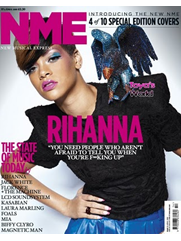
 NME is a popular music magazine and therefore features a range of different types of new music. The target audience for this magazine is quite widespread so needs to be suitable for most people, especially the younger audience. It is aimed at people who are interested in new, in style music and who like to keep up to date with what’s currently in the charts. The cover is also the fourth of ‘10 special edition covers’ which would attract the audience further as it is different from the usual. This specific cover is quite simple yet effective as the colours used compliment each other well and the design is quite ordered. The title of the magazine is over the top of the image which will make it appear obvious to the reader. The cover is to the point and easily readable so will attract the audience as it isn’t to busy. The plain background works well too.
I have analysed three different genres of music magazines which were R&B/hip hop, rock and popular music. From making this analysis I have decided I am going to base my magazine on popular music. This type of magazine features new and recent music which are in the charts. The layout of this genre of music magazine is quite simple yet appealing. I think this type of magazine would be easiest to design and make. Also, the pop genre of music is of interest to me.

No comments:
Post a Comment