Monday 28 March 2011

Evaluation - Technologies


What have you learnt about technologies from the process of constructing this product?


During the construction of my magazine I have used many technologies to help me create my final product. I have used microsoft publisher to create my magazine, microsoft word to annotate my work, macromedia fireworks to save and edit photos, gimp to further edit my photos and a digital camera to take all of the photos. Through creating my magazine I have improved my skills by using these various technologies and therefore creating a professional and suitable product which will appeal to the specific target audience. 

I took my photos with my digital camera, getting  a variety of different shots and angles. I did this to ensure I had enough photos to chose from for my magazine. I had to chose the most suitable photos which would appeal the most to my target audience. The chosen photos had to be edited to make them more attractive and eye catching. I took all of the photos at my house and tried to make them look as professional as possible. They were constructed in a way to ensure the background and model looked suitable for my magazine genre and target auidence. I took the photos against a blank white wall so the pictures I chose to use would make the magazine look like a typical magazine. I also used effective lighting to make the photos stand out more and look more bright. The picture I used for my front cover needed to have a blank background so the cover lines would stand out and would be clear for the audience to read. This would mean that people would be more likely to be interested in my magazine. The photos i chose to use for the contents and double page spread also were taken against a blank white background so the text would be clear to read which would attract the audience.

I needed to edit my photos to make them look more professional. To edit my photos I used an editing program which I downloaded called gimp. This program is eay to use and operate which allowed me to effectively edit and create my chosen photos. By using this program my photos were much more suitable to use and resulted in clear, professional looking photos for my magazine. For my front cover photo I had to edit the image to make it look more professional and suitable for the front cover. I needed to adjust the sizing of the image too, so it would fit accordingly to the size and layout of the cover. I had to add onto the image more of the background to left side so that the cover lines would fit on. I also airbrushed the photo slightly in order to make it look more professional and appeal to the target audience. This made the magazine look like a typical magazine so people would be more interested in it. The original image had a shadow around the outside of the model which looked quite unprofessional for a front cover of a magazine. Therefore I used a photo editing programme which allowed me to remove the shadow without the image becoming tacky. The original image also looked quite sharp so i continued to use the editing programme to soften the photograph. This made the image look more proffessional so that it would work well on the cover. Below on the left hand side is the image I used for my front cover and on the left is the final edited version,


I used all of the above techniques in all of the photographs used in my magazine. The editing process of creating my magazine definitely made it look more appealing and suitable. By doing this the magazine has a more professional look.


The image below shows the gimp editing program I used to adjust all of my magazine photos.

I used Microsoft publisher to create my magazine as shown below. I believe this was the most effective technology I could use to construct my magazine which allowed me to create a suitable and appealing product for my target audience. Also, the program was very simple to use meaning I could create the magazine efficiently while still proving to be extremely appealing. The front cover of my product is very ordered. This look is produced by the structure of the cover lines and how everything on the page is evenly spread out. To create my cover lines I downloaded some fonts from DaFont.com which meant I was able to make the magazine attract my specific target audience appropriately. 

Also, by choosing appropriate fonts the magazine looked professional throughout. Once I had downloaded the fonts I used them to make the product look as appealing as possible by changing the sizes and the colours. I then experimented where to put all my cover lines before eventually deciding where they looked best. I arranged all cover lines and the photo of the model on the cover very neatly making the magazine look mature. By creating an ordered layout the magazine appealed to my specific target audience. Publisher allowed me to move around items on the product until it looked most professional. Publisher made the construction of the magazine an easy process and therefore the ordered layout was created effectively. Also, it was simple to include the conventions of a magazine during the construction process. For example I could easily use the convention of the route of the eye to attract my target audience. When I was constructing the contents page I created columns by using many text boxes to make this effect attract the audience. I also used this column effect on my double page spread and arranged them closely together to get a professional look. To create the page numbers at the bottom of the pages I used autoshapes which made the spread look more realistic. All these technical features I used to make my product the best it could be, made it look more professional and realistic which would appeal to my target audience. My front cover, contents page and double page spread were created in various steps using publisher. I created many drafts of each page before I finally got my final magazine design. Through creating drafts and being able use the tools on publisher efficiently I have drastically improved my technology skills as I have become familiar with the program. I learnt how to use the program to the best of my abilities creating a high standard magazine. 

From constructing my magazine using many different technologies, such as photo editing software and programs to produce my magazine, I have created a professional product. I have developed my skills and now have a better understanding on how to use them appropriately. 

Evaluation - Representation


How does your media product represent particular social groups?

My magazine predominantly involves the social group of teenage girls which I needed to represent in my magazine. There are many ways in which the social group can be represented through the magazine depending on things such as the genre. For example, my magazine is aimed at the pop music genre so the magazine needs to appeal to predominatly teenage females who are interested in this genre of music. On my front cover the model is wearing fashionable clothes which represents teenage girls as they are interested in fashion and can relate to it. However the clothes aren't too dressy and over the top so the readers can relate to it more. The models clothes are very feminine and pretty which will appeal to the target audience as this look is stereotypical of my genre of popular artists. I have represented the model looking happy and quite confident which gives teenage girls a role model type figure. This will then make teenage girls feel more confident about themselves. I chose to do a long shot of the model so the audience can see the whole outfit she is wearing and therefore looks more appealing. The model is wearing black and white so the page doesn't become too busy with many colours. The coverlines on the spread are in bright colours which makes them stand out the most against the image. I feel that this image chosen to be on the front cover is very stereotypical of a pop music magazine. I know this because I previously researched into similar products to give me an idea of how to create my magazine. From this research of similar magazine covers focusing on this specific genre I found that having a female on the cover was most common. Also, the female model usually looks very feminine and made up. This includes having make up and hair done nicely and wearing girly clothes. This makes the cover look as professional as possible. The representation I have used for a teenage girl are very stereotypical. Taking all of these factors into consideration I feel my product meets expectations of a pop music magazine and represents older teenage girls well.

This image is used on the contents page. I believe this photo of the model represents teenage girls well. This is because the model shows the girl to be wearing quite a lot of make up and she looks dressed up. Many teenage girls like to dress up and look nice so they can relate to this photo. The image used represents the stereotypical perception of teenage girls. As the young females will be able to relate to this image they will be more interested in the magazine meaning  I have effectively appealed to my specific target audience well.


   Again, the photo I chose to use on my double page spread is a typical representation of young females for the same reasons as for the contents picture. Teenage girls will be able to relate to the photo and will be more likely to read the article. This is because the image would catch my specific target audiences eye.


I compared my magazine photos to Vibes which is a very similar product to mine. This allowed me to get a typical representation, which I could compare to mine, from a real magazine. 
The images used on both front covers feature a female both around the age range of my specific target audience. The photos are similar in that they both feature a female on the front cover attracting the audience. Also, they are very feminine and fashionable which would appeal to the interests of older teenagers. However, the photo used on the cover of Vibe represents the artist to be much more mature and confident which would possible attract a slightly different audience of more grown up females. Both magazines show the models to be wearing lots of makeup and they both look quite made up which is associated with teenage girls as they care about their appearance.

Overall I think the photos I used throughout my magazine represent teenage females in a stereotypical way. However my target audience will be able to relate to the photos meaning they will be more interested in my magazine and more likely to read it.

Language
Throughout the entire magazine I used language that would be suitable for my target audience meaning they will be more appealed to my product. As my target audience is predominantly 16-21 year old females, I used suitable language for them. For example, I used young, fresh and feminine language and quite a lot of slang. I used this language as this is what you would associate with my particular audience suggesting that they will be more appealed to my product.
For example in the interview I created for my magazine I used many slang terms to make it seem more realistic. Such as 'I know right, it has been pretty crazy!' and 'Hey Katy!'. These examples are typical representations of how teenagers talk meaning they will be able to relate to the article. This will mean that my target audience will be more likely to be interested in, read and buy my magazine.


Also, I used short, snappy cover lines and titles throughout my magazine which would appeal to my specific target audience as the product is simple and easy to follow. These aspects are very appealing as they make the magazine appear really interesting.

Again, I compared the language used in my magazine to other similar real life products. I did this to show that my magazine was realistic and that it would appeal to my target audience. The magazines I looked at did use stereotypical young language such as words like 'nah' and 'yeah' which are everyday slang words. This is typical of what people expect young people to talk like as slang is used in their everyday speech. However, whilst using much slang in my magazine I kept the interview chatty and mature as this would also appeal to my audience as it makes the interview more realistic. 

Overall, I feel that I have represented my target audience as realistically and typically as possible. The language in my magazine represents teenage females to be quite feminine and young in their speech. I did this by using many slang terms and words which would appeal to my audience. This created a quite relaxed and casual conversation in my interview making it sound more realistic.


Evaluation - Progression from preliminary task

Looking back at your preliminary task, what do you feel you have learnt in the progression from it to the full product?


Looking back at my preliminary task, I feel I have improved my magazine creating skills and techniques dramatically. Although the conventions and styles of both magazines are completely different, it was a helpful way to help me create my final music magazine product. When I created both magazines I took the conventions into consideration according to the genre of which the magazine was aimed at. However I feel I displayed these conventions better in the final music magazine product rather than in the school magazine I originally made. As I had already created a magazine prior to making my final product it meant that I could see where I needed to develop my skills further in order to make a more proffessional end product. Through planning and making drafts I was able to take photographs which suited the pop music genre and would appeal to my target audience. Also, the photos had a much more professional look compared to the photo I used for my preliminary task showing that I have developed my skills. The layout of my final magazine  product is more typical of a magazine layout and looks more appealing and easy on the eye. The colour scheme is a lot more attractive and stands out as the colours compliment each other which shows I have understood the concept of conventions as I have developed my techniques further. Also, the fonts used are much more appealing than the ones used in my pleliminary task. This is because they are bolder and are more suitable for a music magazine cover. The costume of the model in my final product will appeal to my target audience as it is very feminine and fashionable which makes the final design more attractive. From creating my product, I feel that I have learnt how to effectively construct a magazine taking into consideration all the conventions and concepts of a typical magazine. All the elements of my product suit my specific target audience so that it appeals to them meaning they will be more likely to buy and be interested in the magazine. By aiming my magazine at a specific audience it ensured the audience will enjoy reading it. Below shows how I have improved from creating my preliminary task to my final product.


The pictures show a strong comparison, which prove I have developed dramatically. I think I have improved my skills greatly from my original preliminary task which is visible here. Both magazines are aimed at different audiences and are about completely different things however, my final product does a much better job of following the conventions and appealing to the target audience. Therefore I believe many more people would be interested in my final product and would be more likely to read it. The layout of the two magazines has greatly developed. For example the preliminary task magazine doesn't really relate to the route of eye principle whereas   in my final product this principle is clearly displayed showing that I have understood the concept. Also, I believe the principle of thirds is shown better in my final product too. I believe I have improved my photo taking and editing skills too which gave me a much more professional look in the final product. The final product displays that I was able to compose the shot better and use mise-en-scene to the best of my abilities which would appeal to the target audience effectively. The fonts I chose to use for my final product work well together and are very bold and eye catching. All the fonts I used are suitable for a front cover as they would catch the audiences eye meaning they would be more interested. I researched similar magazines to get an idea of what fonts looked good on a front cover. Before deciding upon the final fonts I tested many others to see which looked the best and finally came to a decision of which stood out the most. However, in the preliminary task I used very basic and bland fonts which were not particularly appealing due to very little research and planning. 


Through doing my preliminary task and from research and planning my ability to construct an effective and professional final magazine product has greatly improved. I feel I can now take every aspect of the conventions of a magazine and use them effectively to create a good product. These techniques have helped me develop my final product to make it look as professional as possible.

Thursday 24 March 2011

Evaluation - Target Audience


Who would be the audience for your media product?


The target audience for my media product is predominantly female older teenagers/young adults in the age group of 16-20 who enjoy listening to pop and R an B music. I chose to create my magazine with this target audience because my original research showed that this was the most popular. This original research was found out through a questionnaire I created. I asked what kind of music people would want in a music magazine and what sort of things they wanted the magazine to involve. This helped me chose the target audience for my magazine. From the questionnaire I found that the majority of people were female and were in the age range of 16-20 hence why I decided to target my magazine at this group. As this was the age range I needed to make the magazine quite mature so it would appeal and be suitable to them. 

This is the questionnaire I posted on my blog to get my research on what target audience to use for my magazine. I also posted this survey on my facebook account to receive as many results as possible.
 The question below shows that 100% of the people that completed my survey were aged 16-20 and over 80% of the were female. Therefore I aimed my magazine at this audience. 

at ta The below question revealed that about 60% of the respondents preferred the pop genre and about 40% favoured the R and B genre. Therefore I decided to focus my magazine on these genres of music. This would appeal to the majority of people as proved by my survey. I would also feature new and fresh music to keep the audience up to date with these genres. This would keep the audience interested.

Just over 90 % of the respondents said they would rather the magazine use informal language. Therefore my magazine will mostly contain informal language. This is also what you would associate with a target audience of teenagers as they use a lot of slang. My target audience will the be able to relate to the magazine and it would be of interest to them.

From the questionnaire to discover the target audience for my magazine I found out many things from the respondents. I discovered that my target audience would be 16-20 year olds who are predominantly females who have a strong interest in pop and R and B music. From this research I incorporated suitable features which would appeal to this particular group.

The photos below show a media pack provided by Rwd magazine. The media pack tells us who the audience for the magazine is and a few facts about the company.  http://www.rwdmag.com/advertise/ 


The pack tells us that the core audience for the magazine is aged between 15-24, many of whom hold key positions in the music and fashion industries. It also says that the magazine is the only contemporary youth title with an ABC audited distribution and that it has an estimated monthly readership of 240,436. The magazine has also got a website which has proved to be very successful and has thousands of users.The target audience for Rwd magazine is very similar to mine so I was able to compare the two. The genre of music involved in both magazines are similar and the age range is too. Therefore I can relate my product to a real magazine showing that it would appeal to my specific target audience. This is because Rwd is extremely successful. Although my magazine is predominantly aimed at females, whereas Rwd has a varied audience, I can still relate my product to it as they are extremely similar.

From doing this research I discovered the audience for my magazine as the original questionnaire I created reinforced my ideas. Also, from looking at real life examples I can see that my magazine will appeal to the target audience it is aimed at.

Evaluation - Institutions

What kind of media institution might distribute your media product and why?


The magazine which I decided to research was Vibe. I chose this magazine as it is very similar to my product. The genre and target audience of my magazine and Vibe magazine are the same, therefore I was able to compare the two. I found out some information about the magazine which enabled me to see the similarities and differences mine and Vibe magazine. I discovered that the genres featured n both magazines were the same and the audiences were quite similar.


These websites show the information I found out about the audiences of Vibe. Vibe provided a media kit to show all the various media it uses and a partners section which shows who they are partnered with.


http://vibelifestylenetwork.com/VLN-Media-Kit-2011.pdf 
http://vibelifestylenetwork.com/partners/


Vibe has many partners including AllHipHop.com:

AllHipHop.com was founded and launched in 1998 by CEO’s “Grouchy” Greg Watkins and Chuck “Jigsaw” Creekmur. After many years of developing the site, AllHipHop.com has become a valuable resource for hip-hop on the internet, featuring daily news, interviews, reviews, multimedia, a fast growing community and other interesting content. In addition to the website, AllHipHop.com has been delivering daily news alerts to music industry tastemakers and hip-hop lovers two-way pagers, cell phones and email addresses since 1998. Sign up for the AllHpHop.com News Alerts.


I researched Vibe magazine and discovered that it is distributed by an American company called Intermedia Vibe Holdings, LLC. I then went on to find out about this company.


The following websites gives an overview about the Intermedia company:
http://investing.businessweek.com/research/stocks/private/snapshot.asp?privcapId=34669
http://investing.businessweek.com/research/stocks/private/people.asp?privcapId=34669


A company like Intermedia would be good to distribute my magazine as they have been very successful with Vibe magazine. As my magazine is very similar to Vibe, the company would help to develop and attract the target audience as it has with Vibe. As Intermedia focuses only on Vibe magazine it would be able to appeal to similar people as it looks at similar genres. Both magazines are based predominantly at pop and r and b music which is all very recent. Also the layout and design of both magazines are very similar and all contain relevant information.

Similarities between Vibe and my magazine Pulse:

  • Artist to the right hand side of the page
  • Cover line above the title
  • Plain background colours
  • Bright, bold colours for the cover lines
  • Interviews
  • Large magazine name
  • New music
  • Recent pop music
  • Recent R and B music

Evaluation - Conventions

In what ways does your media product use develop or challenge forms and conventions of real media products?

When doing research for my magazine I looked at other magazines which had a similar target audience and genre to what I wanted mine to be. This enabled me to see what the typical look and style of the magazines were. I looked at how I could take into consideration their typical conventions, coulour schemes, fonts and layout etc. I wanted to produce an r and b, pop magazine which mainly featured female artists. Therefore I chose to research and look at magazines which predominantly looked at this same genre of music so it gave me a suitable idea on how to make my product appeal to my target audience. I looked at the conventions each magazine used to attract their audience so it gave me an insight on how to create mine. From investigating this research on similar products I discovered  that there were various conventions each magazine followed. These conventions were different for the the front cover, contents page and double page spread


 The typical conventions of an R and B and Pop music magazine cover are 
  • Large mast head at the top of the page
  • The layout is ordered
  • The cover lines are spaced out  
  • The convention of the route of the eye is used including the main cover lines directly through it
  • An image of an artist featured in the magazine along route of the eye or in the hot spots
  • A colour scheme involving two bright colours, usually with black and or white 
  •   Relevant cover lines
  • Use of pugs
 
In my front cover I ensured that all aspects and conventions of a typical pop and r and b music magazine were used. For example I ensured that the title of the magazine was in a large, bold, different font. This allowed it to stand out the most on the whole magazine grabbing the audiences attention. Using a different font to the rest of the text on the front cover makes it really stand out making it really noticeable. I put the title of the magazine at the top of the page in the masthead so it created an ordered look. I continued the ordered look to the magazine by ensuring that the text was spread out and didn't become too cluttered. The cover lines on the cover were spaced out making it easier for the audience to read. Each cover line was in a different colour which made it easy for the audience to define each one. The whole front cover follows the magazine convention of the route of the eye. I used this convention as it appears on all magazines and it allowed me to lay out the cover lines with the most important ones standing out the most. The title is along the route of the eye which means the audience will easily spot it and know straight away what the magazine is about. Also, the 'special edition' caption is in the route of the eye which is an important piece of information. This will stand out to the reader. The image is the main focus on the cover which is in the middle of the route of the eye. Therefore I made the image look professional and appealing to the target audience as it stands out. 'Free downloads' is along the bottom of the page meaning it is in the route of the eye. This cover line will appeal to the audience as it involves them getting free music. The use of it being in the route of the eye is good as the  audience will be more inclined to buy the magazine. All the main cover lines which would appeal the most to the audience are also in the route of the eye so people would be more interested in the magazine. Another example is that I used a suitable colour scheme that would appeal to people that enjoy this genre of music. Also, my target audience is predominantly females and the colour scheme is more feminine than masculine. The colours I used were typical of this sort of magazine as I used to bright colours which worked well together as well as black. I also used grey on the front cover as I thought it looked more appealing and would attract my target audience more. This colour scheme looks quite professional and looks appealing on the front cover as it is eye catching and stands out. I used relevant cover lines on the front cover which would appeal to my specific target audience as it is of interest to them. For example one cover line talks about V festival which stages many popular artists, so the chance for readers to win tickets would obviously appeal to them. 


The typical conventions of an R and B and Pop music magazine contents are


  • The page is ordered with the articles organised in columns 
  • The colour scheme is the same as the one used on the front cover
  • A plain background, usually white 
  • A sub heading for 'on the cover' and 'regulars'
  • A message from the magazine editor
  • Main image

In my contents page I made sure that all aspects and conventions of a typical pop and r and b music magazine were used. For example, I organised my contents page so that it looked ordered and professional. I did this by putting the articles and their page numbers in columns which created an easy to ready page. With an easy to read contents page it makes the magazine easy to navigate around as the reader can refer back to the contents page. Therefore having an ordered structure is very suitable and would appeal to the audience. The columns are also separated by a dashed line which ensures that the page doesn't become confusing. Another example is that I used the same colour scheme to that of the one I used on the front cover. This is a typical convention of any music magazine so I needed to include it in my product to make it look more professional. This gives the magazine a theme and is easy on the eye which will attract the audience. The colours are very bold too, so they will keep the reader interested. I used a plain white background on the contents page as it looks more effective and is typical of a pop music magazine. The background is also similar to that of the one on the front cover so it carries on the theme. Having a white background is very simple yet effective as it ensures the text is easy to read and that the magazine doesn't look too busy or cluttered but instead ordered. The ordered layout will appeal to the reader more. From research I found out that most music magazine contents pages of my genre had sub headings for 'regulars' and 'on the cover'. Therefore I included these on my contents page so it would appeal to my specific target audience. This convention allows the audience to know what to look for. The favourite pages of the magazine will be featured in the regular section which will appeal to the reader. This is because these articles will be easy to find. These headings needed to be clear to the reader so I put them in a bold, bright font making them stand out. Usually on the contents page of a magazine there is a message from the editor. This feature is very conventional of a music magazine.  I added this message to ensure the audience could relate to the magazine. This message makes the audience feel like the editor is talking to them individually, involving the audience in the magazine. Therefore I made the message quite attention grabbing and made the magazine sound exciting as this is the first thing the audience reads. I put this at the top of the page to the right of the main image in a simple font so it's easy to read. The black font colour stands out on the white background making it clearly visible. I used a main image on the contents page to the left hand side. This photo stands out and would appeal to the audience as it allows them to see what is inside the magazine. However, this feature is not typical of every music magazine, as some feature a few smaller pictures.

The typical conventions of an R and B and Pop music magazine double page spread are
  • Simple background
  • An image of the artist
  • Different style and font to the cover and contents
  • Questions in a bold and or different colour
  • An in depth article with many questions and answers
  • Pull quotes

In my double page spread I made sure that all aspects and conventions of a typical pop and r and b music magazine were used. For example, I used a simple background. I included this convention as it mad the article text stand out and was clear and simple to read. This would attract the audience as it is easy on the eye and looks more appealing. The white background I used is suitable for the colour of the text on the spread as they compliment each other well. The black writing works well with white and the bold pink colour is very bright which would stand out and appeal to my specific target audience. I used a photograph of the artist being interviewed on the double page spread so it would attract the audience as it makes the page look more appealing and suitable to the genre. The image used is also suitable for the specific target audience as the artists fits in with the genre well. The image looks professional too, which would attract the readers as it looks like a typical magazine. This convention is used in most music magazine so it works well with the rest of my product. Also, the image used is similar to that of the one on the front cover as it is an interview with the cover artist. The artist is wearing the same clothes which is a good convention as it allows the audience to easily recognise the artist. The font used on this spread is different to those on the front cover and contents page as to make it more individual and separate from them. I also followed the convention of using few fonts on the spread to make it more appealing to read. In the article i used a serif font so the text was easy to read which would attract the reader. By doing this it makes the pages look more professional by  creating a simple and clear article. For the title of the spread I used a different font highlighted in black which stands out on the spread. However, I used the same colour as on the front cover as it relates to the artist and the reader would associate the colour with that artist. Another convention which I followed was that the questions were in a bold and different colour to the answers. This separates the two and makes it easy to distinguish between the two. The reader would then find this easier to read as it is simple to follow. My article is in depth and has many questions and answers which would appeal to my audience as they would want to know about the artist and what they are like. The language used in my article is typical of teenagers so the audience can relate to the artist too. This is typical of a pop music magazine. Also it makes the magazine seem more realistic. The interview is very relaxed and not very serious so it is more fun to read. The interview is chatty which allows the audience to relate to it. A lot of slang language is used by both the interviewer and the artist and they both are very friendly which makes it easy to read. For example, some quotes in the interview that show this are 'Hey Katy', 'I know right, it has been pretty crazy!' and 'other than being forever tired'. The interview includes personal things about the artist so the reader is kept interested. Also, as the magazine is about music much music related conversation is used to keep the audience interested too. I used pull quotes which is another typical convention. This broke up the text to make it look more interesting and less intimidating to read because it would look too much if the pages were just text. The pull quote font was bolder than the article and was in a different colour which made it stand out. I ensured that I used an interesting quote from the article so it appealed to the audience.

    Monday 21 March 2011

    Evaluation - Focus Group

    For my focus group I chose a few people who fit the target audience my magazine is aimed at. Therefore I asked questions regarding my final magazine to older teenagers/young adults females who have a strong interest in predominantly the pop and r and b music genre so would potentially enjoy reading my magazine. I showed the people in my focus group a sample of the front cover, contents page and double page spread and asked them what they liked and didn't like in order for me to make improvements in the future. I also asked for them to suggest strengths and weaknesses of all aspects of the magazine. Finally, I asked my focus group to rate my magazine out of ten so I could see if it attratcs to the specific target audience.

    What are my magazines strengths?
    What are my magazines weaknesses?
    How could I improve my magazine?
    Rate Pulse out of 10

    Person Number 1
    Front cover - "I love the colour scheme as it is really eye catching and stands out. The fonts used are good as they are clear to read and are attractive. The image looks very professional and the overall layout of the magazine is appealing. To improve the cover props could be used to show the magazine is about music."
    Contents page - "I like the layout of this contents page as it is very clear to understand and the fonts used are quite simple but effective. The bold page numbers are good as it would be easy to navigate around the magazine."
    Double page spread - " I like think the pull quote looks very effective. The bold black background  of the quote really makes the pink text stand out. To improve the spread more questions could be asked in the interview."
    Rating - 9/10

    Person Number 2
    Front cover - "The cover is very appealing. I think it would be suitable for a music magazine. The use of fonts and colours are good as they stand out. I also think the layout is designed well and it looks like a typical magazine." 
    Contents page - "I like how this contents is easy to follow yet it looks very attractive. The colours and fonts are the same as on the cover which is good as it gives the magazine a theme. The image looks professional too."
    Double page spread - "The way this spread is laid out is very appealing and would catch the readers attention. I like how the questions and answers are in different colours so it is easy to read. The spread isn't over the top but is quite simple which is good because its easy on the eye. To improve another pull quote could be added."

    Rating - 9/10

    Person Number 3
    Front cover - "I love the colour scheme used on this cover as the colours work well together and stand out. However, the scheme would appeal mostly to girls. I like the layout as it look very professional and the photo fits in well."
    Contents page- "I like the photo at the side of the page as it is different and looks quite professional. I think the page is easy to follow and articles would be easy to find in the magazine."
    Double page spread - "I really like how the title and the pull quote are highlighted in black as it makes the stand out the most on the page. I think the colours work well together too. I think the blank spaces on the spread need to be filled which would make an improvement."

    Rating - 8/10

    Monday 14 March 2011

    Evaluation - Appeal to target audience

    Final magazine survey results

    I created a survery on http://www.surveymonkey.com/ in order for me to get responses about my magazine. From these results you can see I got a very good representative sample of my target audience opinions on my magazine. I know this because most people who took part in the survery were females aged 16 - 20, which is whom my magazine is aimed at. This allowed me to make a fair assumption of what most people would think about my magazine and to see if the techniques I used worked or not. I can also see their personal opinions about my magazine. Overall, i recieved very positive results and opinions from my survey suggesting that it attracts and appeals to my target audience appropriately. 
    I posted this survey on my blog http://molliehinson.blogspot.com/ and on my facebook account allowing me to get responses which would more likely to be from my specific target audience. Also, this would give me as many results as possible.


    In the survey I included questions about  my front cover to see what people specifically liked and disliked about the cover. These below responses are the results I got:
    Many of the responses show that people liked the colour scheme I used on the cover suggesting that it worked effectively and would attract people to the magazine. Many people also said that the magazine had a professional look about it as they thought the layout looked good. Having a porfessional cover is very important as this is what attracts the audience to the magazine. If the magazine didn't look professional it wouldn't appeal to the audience. A tacky look would make the magazine unattractive. Another point made from the responses was that the main image on the cover looked appealing and attracted the audience to the cover. This is a key feature of attracting the audience to the magazine as it takes up most of the front cover. All of these factors give the impression that people would buy the magazine. One response said that the cover was too feminine which I could improve upon. However, my cover is predominantly aimed at females.

    I asked in my survey how I could improve my cover and these were the results: 
    Most of the responses show that no improvements should be made to the magazine  and that the cover was good how it is. However two results said that props could be used to show to make it more clear to the audience that it is a music magazine. This is good as it shows that my target audience likes my magazine and it doesn't need to be improved. 


    Overall, my front cover proved to be very effective as it appealed to the specific target audience it was aimed at. I didn't need to make any adjustments to the cover as it appealed greatly to the audience already. The cover succeeded in attracting my specific target audience. 


    The results I received for my contents page proved to be very positive too. The responses are shown below:

    The results show that people liked the continued colour scheme and fonts used. This is because they are very eye catching and bold which makes them stand out greatly. Having a continued colour scheme from the cover to the contents is a typical convention of a magazine. Many people thought the layout of the page was good and that it was easy to follow and read. the clear design meant that it was easy on the eye which appealed to my target audience as they would be more likely to read it. Also, people said that the bold page numbers made it easy to understand where things were in the magazine meaning it was easy to navigate around. 

    I asked the audience for improvements I could make to my contents page. The results are shown below. Many people said that no improvements should be made which is good as it proves it appeals to my target audience. However, many people said I should use fewer, smaller pictures which would improve the page. Although these improvements were suggested they were very vague. The contents page proves to be very successful, however slightly less appealing than my cover.

    Next I asked questions about my double page spread to get feedback from my target audience. I asked whether the spread appealed to them and why. The results are shown below:

    From these results I can see that there are many different ways in which the spread appeals to the audience. Many of the answers said that they liked the layout and that the text and image were positioned well making it clear and easy on the eye. This would appeal to the audience as its simple to read yet effective and bold. People said that they thought the article was very interesting and that they enjoyed reading it. A response said that the text was easy and clear to read which is an appealing aspect. Again, the colour scheme used proved to be very popular meaning that people are drawn to bright colours with a black font used for the article to make it look professional. People liked the title as it's very bold and stands out on the spread drawing them into the article. 


    Again, I asked whether they thought any improvements should be made or not. The results are shown below:


    The responses for this question were again quite vague, but many people thought that the page could use a larger variety of fonts. However, if I did this the page could become less professional and might not appeal to my audience. A suggested improvement was to add another pull quote to make it more eye catching. 

    In the survey I asked whether people would read my magazine and there was a high percent of respondents that answered yes. This shows that my target audience are interested in my magazine and that it has successfully appealed to them.

    Finally I asked if the font and colour schemes used in the magazine appealed to them. Again, the percentage was very high for yes showing that this aspect attracts the audience.

    Overall, from looking at the responses given in this survey, I think my product greatly appealed to my target audience. The results show that people liked my magazine and thought it was very effective and appealing other than very few minor improvements. This shows that the techniques I used throughout creating my entire magazine worked well and made the audience attracted to the final product.

    How did you attract/address your audience?

    The audience for my magazine is predominantly female older teenagers/young adults who are interested in pop and r and b music. In order to appeal to this audience created a suitable layout, used appealing fonts, colour schemes and images which would attract them to the magazine. I also included topics that covered the said music genres. 

    Front cover
    The front cover of my magazine was very important. This is due to the fact that this page is the first thing the audience see, therefore it needs to be eye catching. I used as many conventions on this page too. 

    The title of the magazine is placed at the top of the page due to the fact it is a very important feature. The title is at the top so that the audience can easily see then name straight away, The font I used for the title is very bold and stands out on the page against the other colours used. I used black for the title font as it made the magazine look more professional and stands out from the bright colours of the cover lines. The next most major thing the audience see is the image. The image I used on my front cover follows on from the title in line with the route of the eye convention. Using an appealing image is an important factor as it makes the reader more interested and therefore more likely to buy the magazine. Also, by having the image here it provided me with good space to add cover lines and other features to the cover. In my survey results revealed that most people would prefer an ordered layout to a cluttered one so I created an ordered layout to appeal to as many people as possible. The next thing that the audience will see is the main magazine article. This main article needs to appeal to the audience as it will make them want to read more. On the cover I used a different font to the rest of the text. This made it appear to stand out more, catching the audiences eye. The most important features on the front cover are in the route of the eye as the audience will spot these straight away when glancing at the magazine. The colour scheme I used on the front cover was suitable for my target audience as it is quite feminine but mature looking at the same time. The colours I chose to use were pink, blue, grey and black. I spread out the different colours well, ensuring that the magazine looked even and spaced out. I only used a few different fonts on the cover which made it look more professional and carried non with the ordered theme to the magazine. If I used lots of different fonts the magazine could look immature and cluttered. 
    Contents page
    My contents page is also extremely important as it is the second page that the audience see and the reader has to refer to this page to know which pages to go to. Therefore this page needs to be eye catching and stand out. I had to make the layout interesting ensuring that it didn't look too plain. To make the contents page appealing I used many different conventions to do so.

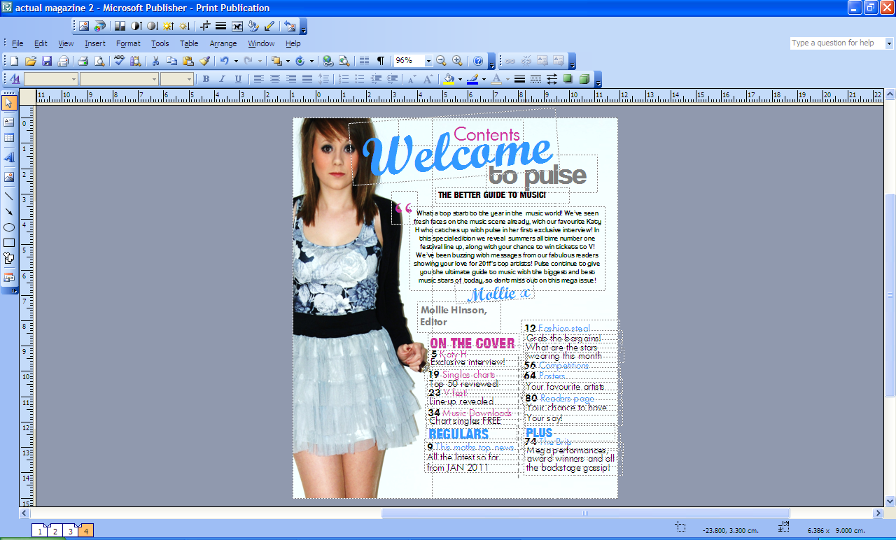
    As you can see by the above image, the principle of thirds has been used conventionally. The image is in one column and the article pages are exactly in the other two columns. This separates the information in a neat ordered way which will appeal to the audience as it is easy on the eye. Again, the route of the eye convention has been used professionally on this page. The first thing that the audience will see is the face of the model which has to be appealing to attract the target audience. The image used shows a stereotypical representation of a fashionable teenage girl which is my target audience so will appeal to them. Next, the audience will see the title of the page welcoming the readers to the magazine which is another important aspect of the page. I used bold bright colours for the fonts here as it will appeal to the audience grabbing their attention. After reading the title of the page the readers then see the editors message. This is a very important feature of the contents page as it tells the reader about the issue and welcomes them to the magazine. Therefore it has to make the magazine sound interesting which I did on my product. There is also a signature from the editor which makes it more personal and makes the reader feel involved in the magazine. Along the route of the eye, the next thing the audience will see are heading for article pages and the different articles. This is an important feature as it guides the audience around the magazine and is essential for attracting the reader. When the reader scans over the page and sees articles of interest to them, then they are more likely to read the magazine. I used bold bright fonts and colours for the headings of the different articles such as 'on the cover', 'regulars' and 'plus'. I did this so that the page was easy to navigate around and so the reader could easily spot articles which they wanted to read. I also put the page numbers in bold so the audience knew where to find certain things quickly. 

    I used the same colour and font scheme for the contents page as I did on the cover of my magazine. This consistent style throughout the two pages gives the magazine a professional look making the reader want to read on. By keeping the colours and fonts the same the magazine looked quite mature which will appeal to my specific target audience.
    Double page spread